March Madness is in full swing, and the NCAA Tournament officially starts today at noon! Hello basketball, goodbye productivity. Hello flames, goodbye perfect brackets.
While I have watched a total of a whopping four college basketball games this year, one thing I remain fully invested in is the analysis of NFL uniforms. My idea of dressing up is wearing a sweater instead of a hoodie with my yoga pants, but I believe that I am fully qualified to seed each NFL team according to their home and away uniforms. Alternates are a completely different animal for another time — specifically one when I should not have been asleep four hours ago.
I’ve seeded each team according to the league’s North, South, East, and West divisions, and will put up polls on Twitter in order to determine the winner at the end of it all. Before you yell at me because all of my seeds are wrong, please read my explanations for each. But don’t yell at me after that, either. Thank you and proceed with caution.
**See a larger version of the bracket here.
North Division
1. Minnesota Vikings

I won’t claim to be an expert in Scandinavian history, because I know absolutely nothing about it, but if there were to ever be a “Viking” font, it’s what graces that soothing purple hue on Minnesota’s uniforms. If those poor precious souls in Minneapolis must watch Kirk Cousins burn their team’s money with the ferocity in which you will burn your brackets, this is precisely what I’d want him to be wearing.
2. Baltimore Ravens
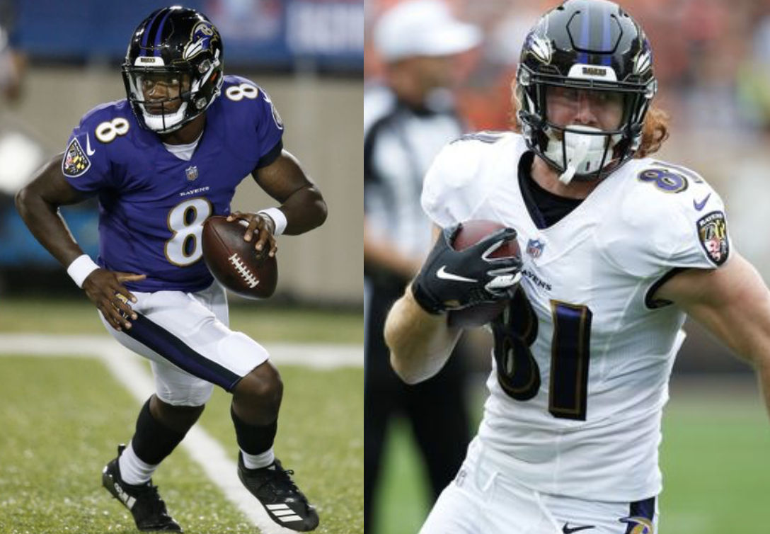
This particularly dark and ominous shade of purple combined with black reminds me of a bruise, but in an intimidating way. Ray Lewis ~may~ have given out more than just bruises back in the day, but the uniforms are nonetheless striking fear into opponents in 2019.
3. Chicago Bears

It’s a clean, simple design that has stood the test of time. You can’t knock that (and even if you wanted to, don’t, because Khalil Mack could kill you in one fell swoop). However, the numbers sort of look like their grandma hugged them way too tight when they got home from college. I have love for these uniforms, just as a grandma does, but they’re a bit smushed (technical term).
4. Pittsburgh Steelers
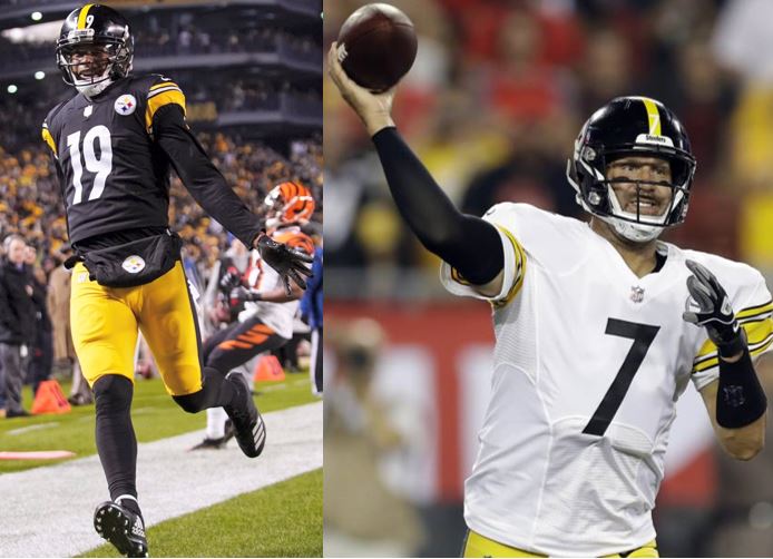
Nothing about these uniforms is overly eye-catching, but one can appreciate how Pittsburgh sports teams maintain a fairly similar color scheme, creating a united feel throughout the city. But is it just me, or is the top of Ben’s “7” way too short? It’s an improper fit for his figure. This fact alone has tainted my view of the team for years.
5. Cleveland Browns

Although brown is most known for being the mess of a color you get when you mix every other one together, its pairing with orange strangely reminds me of the orange and brown M&Ms. This could be because I recently visited M&M World in NYC, or I am just hungry. Did you know that all M&Ms are named solely after their color, but the brown one is called Mrs. Brown? Pretty fancy. M&M association earns you a more favorable ranking every time.
6. Detroit Lions
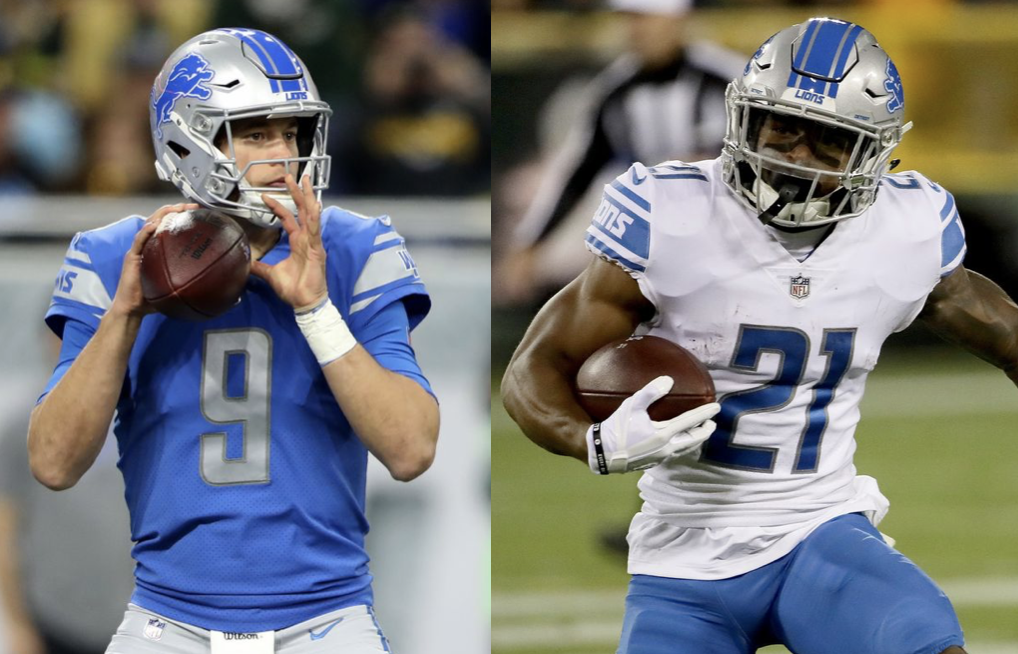
The Lions tried to get cute last year and ruined what used to be some of the most ravishing uniforms in the NFL. If that pristine powder blue was the Lions’ quarterback, the Super Bowl rings would cover more than one hand. The new color and design just don’t sparkle the same way, but are totally going to pass for 5,000 yards every season and break all Lions team passing records.
7. Cincinnati Bengals

The tiger stripes take me back to the middle school days where if you didn’t own at least fifteen items with some sort of animal print on them, you were a total loser. If I do recall, no one was rocking tiger print, but kudos to the Bengals for trying. (Where have we heard the latter part of that sentence before?)
8. Green Bay Packers

Points are awarded for the on-brand cheese-colored yellow and nailing the “green” in “Green Bay,” but the combination of the two just reminds me of moldy cheese. I understand that most mold is usually more of a blue, but it doesn’t matter because I have now put that thought in your head for eternity.
South Division
1. Jacksonville Jaguars

Wow, that teal is so stunning that it allowed Blake Bortles to appear starting-quarterback-worthy for a whole five years. Unreal. Majestic. Magnificent. Enthralling. I can’t stop rattling off adjectives. There’s nothing else left to say.
2. New Orleans Saints

Gold is the color of CHAMPIONS (and apparently those who are on the unfortunate end of egregiously missed pass interference calls). But still, CHAMPIONS (in 2010) (and in their minds in 2019). Plus, for some reason, their black looks way cooler than any other team’s black. You know it’s true, but none of us know why.
3. Carolina Panthers

The electricity of that bright blue against the black carries almost enough wattage to make you think that Cam Newton is still entertaining to watch. Almost.
4. Tennessee Titans

Gotta say, it was extremely thoughtful of the organization to try and make the Titans’ uniforms as cool as Mariota’s selection at Oregon was. They have yet to jog his memory of the time he won the Heisman, but it’s not for a lack of effort.
5. Atlanta Falcons

It’s a very solid uniform that could make anyone look like they know how to play football, but I think that Matt Ryan and Russell Gage look best in it, no? Tom Brady agrees, and he wears Uggs, so this is a correct opinion.
6. Houston Texans

The Texans’ uniforms are like the 1:00 playoff game that they play on Wild Card Saturday every year. I’m interested, but I’m going to forget about it ridiculously quickly.
7. Tampa Bay Buccaneers

Ever since the Bucs overhauled their uniform design a few years ago, I’ve had a bone to pick with the font. It looks like it’s trying even harder to be cool and hip than the dads of Instagram. Unfortunately, half of the uniform cannot decide if it is a nasty shade of gray or a putrid shade of brown (I don’t wanna hear about “pewter”), and the font wildly exacerbates the issue.
8. Indianapolis Colts

I’m torn between trying to act old school and compliment their “simplicity,” but that would be inauthentic of me. Blue and white, boring font (is that Times New Roman?), and not even an appearance from their horseshoe logo to spice them up. These uniforms may be even more bland than their starting quarterback and his flip phone.
East Division
1. Philadelphia Eagles

Use of the word “midnight” to describe one of the colors in your scheme automatically makes the uniform bad ass. Additionally, the font may be the most exquisite in the NFL. I said “may,” so I’m clearly not being biased as I type this with Lincoln Financial Field in my line of sight.
2. New England Patriots

You can hate the Patriots, but you can’t hate America. (You can rank the Eagles ahead of America since, you know, the bald eagle.) All these uniforms are missing are a hot dog and a pair of jorts. Admittedly, football would be difficult to play in jorts, but world-renowned Patriot killer Mark Sanchez proved that hot dogs are the perfect sideline cuisine.
3. Miami Dolphins

These uniforms emit a bright, beachy vibe, which makes sense not because it’s Miami, but rather that the Dolphins have plenty of vacation time year after year. I would get drunk under an umbrella with a fruity drink while wearing this uniform, no question. Unflattering tan lines be damned.
4. Buffalo Bills
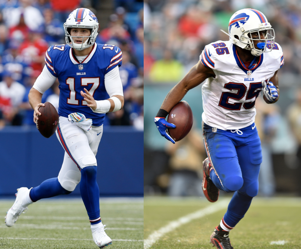
The blue pops nicely, and once again, we’ve got to appreciate an American color scheme. Try as they may, they are not the Patriots, and never will be. Neither will the uniforms.
5. Dallas Cowboys

The weird pale blue pants on the home uniforms clash so terribly with the brighter royal blue that you completely forget that sometimes they wear a very solid dark blue & white combo. Unfortunately, I can’t even award them a few bonus points for it. Like where the hell did that pale blue come from?? It reminds me of the color of the water in the disturbingly warm, dungeon-like pool I used to take lessons in. No one asked for it, yet the Cowboys insist on wearing it for 95% of their games. Please tell me someone else agrees.
6. New York Giants

An otherwise lame uniform gets a boost by the switch-up between the blue and red in the home vs. away designs. And that is the nicest thing I will say about the Giants after the irreparable harm they have caused for Saquon.
7. Washington Redskins

There’s something about these uniforms that makes them even more out of touch and uninspiring than Dan Snyder. That’s not even a joke. I don’t have any jokes. They just stink.
8. New York Jets

Even when Christian Hackenberg played for them, the uniforms were still the most unappealing part of the team.
West Division
1. Los Angeles Chargers

You literally cannot get more electric than lightning bolts on a uniform. Additionally, the font is irresistibly sleek. How else do you think Phil Rivers ended up with ten kids?
2. Los Angeles Rams

Remember when no one could figure out if that dress was black and blue or white and gold? It’s kind of like a merging of the dresses, which was an extremely exhilarating time to be on the internet. You can’t put a price on memories, especially stylish ones.
3. Seattle Seahawks

Here we stumble upon another classic case of a futuristic-looking font trying to fit in with the youths, but this time, it plays nicely with the lime green and a gray that isn’t trying to pretend to be anything other than just that. Confidence goes a long way in this life, and I’m buying what the Seahawks are selling.
4. Denver Broncos

Someone paid attention in first grade art class! ICYMI, blue and orange are complimentary colors on the color wheel, and thus pleasing to the eye. “E” is for “elite,” but “O” is for “outstanding,” and that’s what the designer earned on his report card. Additionally, please note how the numbers look extra rounded — nice to see someone finally embracing curves in 2019.
5. Arizona Cardinals

I’ll advise you to refrain from fact-checking this, but red has to be the most common color in all of sports, right? Similar to the Cardinals’ 2018 season, these uniforms do not separate themselves from the pack. At least it got them the #1 overall draft pick! Helloooo, Kyler.
6. Oakland Raiders

These are marginally less likely to induce a nap than the Colts’, due to the natural edginess of the color black and the shine the silver can omit in the correct lighting (which, typically, is tough to find in the Black Hole). Plus, they match perfectly with Derek Carr’s eyeliner. Wait, is matching in or out? I can’t keep track.
7. San Francisco 49ers
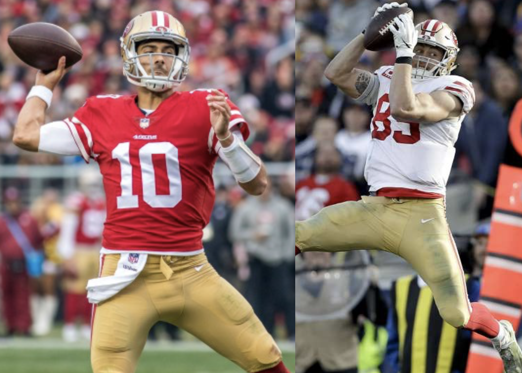
Those numbers need to bring back their dark outline so badly that I can’t focus on making any accompanying jokes about Jimmy G’s dating habits. Perhaps I’m just maturing?
8. Kansas City Chiefs
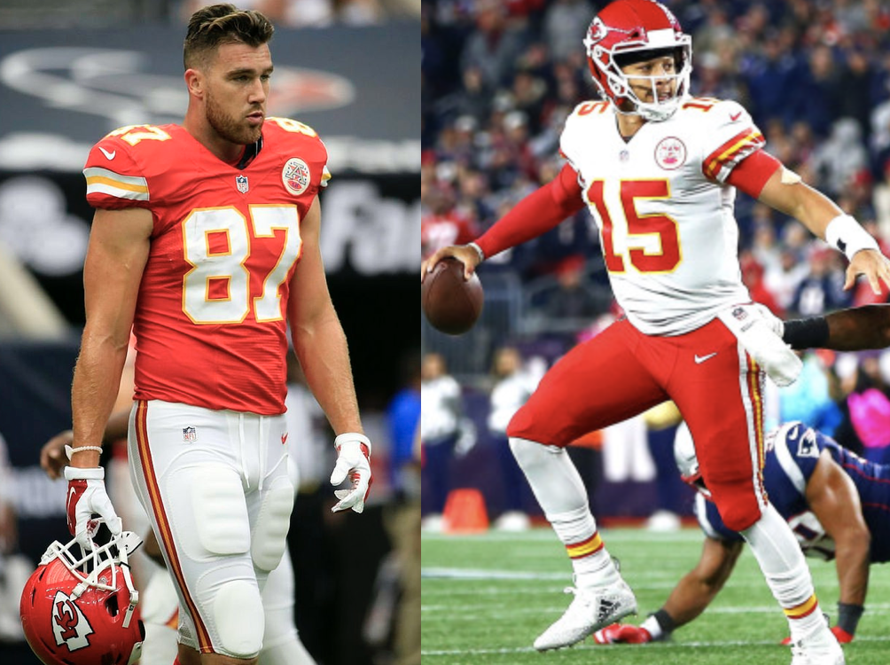
Have the red home uniforms blinded anyone else yet? Our increasingly impaired vision certainly couldn’t be the fault of the absurd amount of time that we spend staring at screens. Just blame the Chiefs (but not Pat Mahomes).
Be sure to answer the matchup polls on my Twitter throughout the NCAA Tournament at @_supcaroline! Obviously my rankings are correct but I’d love to know what you guys think as well. Happy bracketing!
